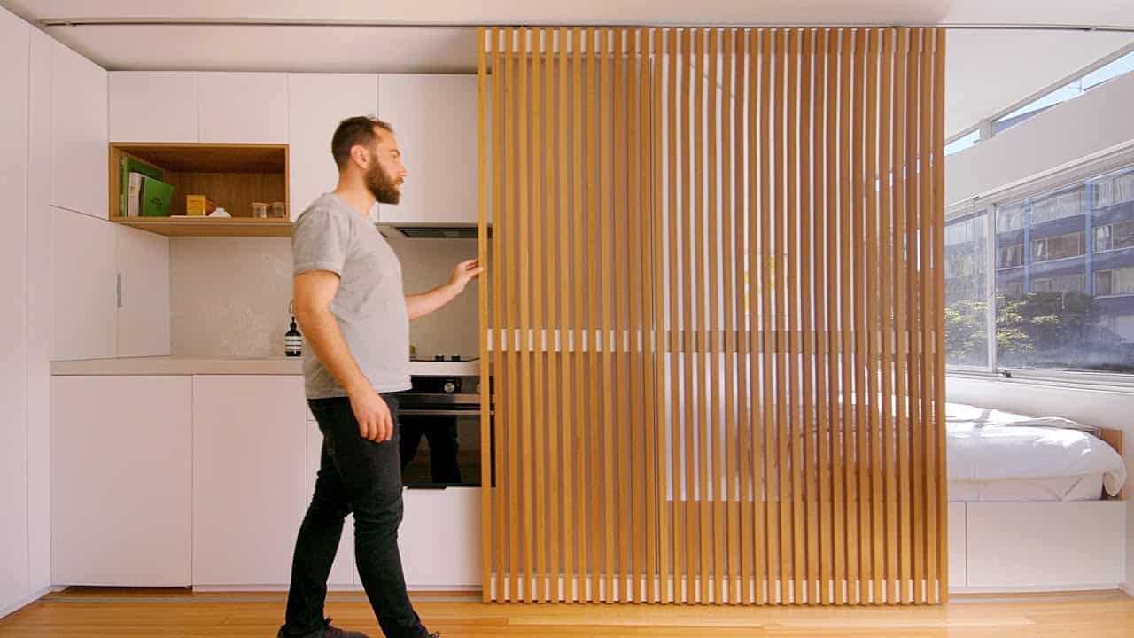
This apartment located in Rushcutters Bay which is a suburb in walking distance of the city as well as Sydney Harbour.
This apartment building was built in the 1960s and there are about 4 studio apartments in the block, this apartment 24 square meters, when we first got the apartment was completely different to what it currently is when you walked in the original apartment you enter through a corridor which contained the kitchen and the living space was combined with the bedroom
we completely demolished everything within the existing apartment we decided it was really important to have a strong divide between what’s sleeping and what’s living so we contained the amenities of the apartment and the sleeping space the smallest possible area so the living area could be as big as possible so the design idea was to have a sliding screen that could determine the function of the apartment at any one time during the day the timber screen creates a visual separation from the bedroom to the living area while still allowing light to pass through when the bedroom space is closed, and I it can slide over the kitchen opens up a sleeping space there’s a little open shelf which acts as a bedside table and includes an integrated lighting, the beds raised up and includes drawers underneath it for extra storage one thing unique about the apartment is the full-width windows and we wanted to make that obvious from the moment you walk in we angled the joinery unit next to the bed so we can pick up light and a sense of space the material palette was kept to a minimum the black bud timber screen is the same as a black bud timber floor that added a softness to the apartment the bathroom and walk-in robe are accessed via a hidden door combining the bathroom and you’re walking road makes the whole space feel much bigger, the gray tiles in the bathroom complement the timber floor gives the whole apartment a really earthy feel a combined with concealed lighting create a luxurious feel as well as soon as you walk through that door there’s a full-length mirror beyond gives you a sense of a larger space the kitchen was really carefully considered it includes a fridge and oven a dish drawer and a narrow cutlery drawer the kitchen also integrates a little appliance cupboard incorporate full hi pantry stack with the minimal material palette our bench top and splashback are also a gray concrete cities like Sydney have some amazing old housing stock that’s been solidly built and isn’t going anywhere and repurposing that amazing housing stock to bring it up to the way we want to live our life now or you know just given that refresh is one of the most sustainable ways we can continue to grow our cities
